A radio button is a type of graphical user interface widget that allows you to choose one of a predefined set of options. For creating, moving, resizing, deleting, duplicating the buttons and setting tab order please refer to “Push button”.
Tip: How to toggle radio buttons
For the radio buttons in a group, they should have the same form field name but with different export values. This ensures that the radio buttons toggle and that the correct values will be collected in the database.
- Please use copy-paste to create multiple copies if having more than one form field with the same name. After this, to make the value usable, you have to change the value of the radio buttons to make sure all radio buttons have the same field name but different export value.
- Please note you cannot use “Create Multiple Copies” option if there is more than one radio button with the same name. A warning message will pop up if you right click and choosing Create Multiple Copies.
Set radio button properties
How a radio button behaves is determined by settings in the Radio Button Properties dialog box. You can set properties that apply formatting, determine the appearance and actions, and so forth.
The radio button has a General tab, an Appearance tab, a Position tab, an Actions tab, and an Options tab as push button.
1. The General tab
Most items in this tab are the same as the ones in the properties of Push Button. Please refer to Set Push Button Properties for details. For the Required option:
- Required – Forces the user to click the radio button. If the user attempts to submit the form while a required radio button is not chosen, an error message appears.
2. The Appearance tab for the radio button properties
The Appearance properties determine how the radio button looks on the page. The Appearance tab in push button properties contains the following options:
- Line Style – Alters the appearance of the frame. Select Solid, Dashed, Beveled, Inset or Underline.
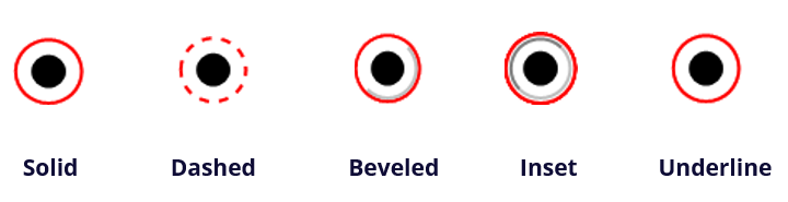
The appearances of Radio Button with different line styles
Note: You may not see the difference if no color is chosen as the border color.
- Thickness – Specifies the width of the frame surrounding the radio button: Thin, Medium, or Thick.
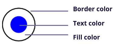
- Border Color – Opens a color picker in which you can select a color for the frame surrounding the button. To leave the button without a frame, select No color.
- Fill Color – Opens a color picker in which you can select a color for the background behind the button. To leave the background uncolored, select No color.
Note: A Fill Color choice other than No color will block any images on the PDF page that are behind the button.
- Text Color – Opens a color picker in which you can select a color for the button.
Radio Button
Note:The items of Font Size and Font are not available in the Appearance tab for the Radio Button properties.
3. The Position tab for the radio button properties
Please refer to “Position tab for the button properties”.
4. The Actions tab for the radio button properties
Please refer to “Actions tab for the button properties” .
5. The Options tab for the radio button properties
The Options tab in radio button properties enables you to change the button style and do other additional settings. The Options tab in radio button properties contains the following options:
- Button style – Specifies the shape of the maker that appears inside the button when the user selects it. There’re six choices in total: Check, Circle (the default), Cross, Diamond, Square, or Star. This property does not alter the shape of the radio button itself.
- Export Value – Identifies the radio button and differentiates it from other radio buttons that share the same Name value. The status of a radio button is “yes”. You can give them other names with this box.
- Checked by default – Sets the selection state of the button when the user first opens the form.
- Radio buttons with the same name and value are selected in unison – Allows single-click selection of multiple related radio buttons. If the user selects a radio button that has the same field name and export value as another, both radio buttons are selected.
- Click Close to accept these display properties.
Set radio button properties as default
After setting radio button properties for a new radio button, you can set your settings as the new default for all the radio buttons you create in future.
To set the current properties as default, right-click the radio button, select Use Current Properties as New Defaults.