Create a new push button
Choose Form > Push Button , and your cursor changes into
 . Then do the following:
- Drag an area in the desired place to create a push button.
- A box appears under the button for you to input the button name and the name of label.
- You can also click the All Properties to do more settings.
Move and resize a push button
- To move a push button, select the Select Annotation command or push button, click and drag the button to move it to a new location.
- To resize a push button, select the Select Annotation command or push button, click to select the button, and then drag a border handle.
Delete a push button
- Select the Select Annotation command or push button, and click the push button you want to delete.
- Press Delete, or right-click the push button > Delete.
Create multiple copies of a push button
You can create multiple copies of a push button. The new push button names are based on the original push buttons and appended with a number. However, you are able to create them with the same names. In addition, all the new push buttons are created sequentially, using standard array format.
- With the Select Annotation command or push button, select one or more push buttons that you want to copy (press Shift or Ctrl when clicking to select more buttons).
- Right-click one of the buttons > Create Multiple Copies…
- In the Create Multiple Copies of Fields dialog box, do the following:
- To specify the rows to be created, enter or select a number in Copy Selected fields down (times). The default number is set to 2.
- To specify the columns to be created, enter or select a number in Copy Selected fields across (times). The default number is set to 2.
- To specify the width of the area in which the columns of fields appear, enter or select a number in Change Width (in). The default number is set to 0.04.
- To specify the height of the area in which the columns of fields appear, enter or select a number in Change Height (in). The default number is set to 0.04.
Note: The width and height values don’t change the dimensions of individual fields but designate the size of the entire area for all the selected and newly created fields.
- To change the position of buttons, use the Up, Down, Left, and Right buttons in the dialog box.
- Click Preview to preview the result in the document area.
- Click Same Name to apply the names of original buttons to the newly created buttons.
Click OK.
Note: Copies of push buttons function independently of each other. You can use a different procedure to duplicate push buttons, creating an information- sharing relationship among these buttons.
Duplicate a push button across multiple pages
- Select the push button that you want to duplicate.
- Right-click the button > Duplicate…
Note: The Duplicate command isn’t available for forms with only one page.
- Then do one of the following:
- To duplicate the push button on every page in the form, select All, and click OK.
- To duplicate the push button on odd/even page in the form, select Odd pages or Even pages, and click OK.
- To duplicate the push button on a limited range of pages, type the starting and ending page on which you want the button to appear. Click OK.
Note: Enter the page number including or not including the page on which the button originally appears doesn’t affect the duplication process. Including that page won’t create a second copy on top of the original one, and not including it won’t remove the original button.
Set tab order
When navigating form fields using the Tab key, you can set the tab order of the buttons you created. By default, the tab order is based on the document structure. There are three ways you can choose to set tab order.
1. Set tab order in the Fields panel
1) Open the Fields panel in the Navigation Pane.
2) Click the Display Order icon  in the upper-right corner of the Fields panel and select Tab Order (Note: If you select Alphabetic Order, all the form fields will be displayed alphabetically by the field names. Then the Set Order
  icon next to the Display Order icon disappears.).
3) (Optional) Select Show Tab Numbers to view the tab order. The order number will show on the top left corner of a field.
4) Click the Set Order icon and choose any of the following:
- Order Tabs by Row – Order tabs from the upper-left field, moving first from left to right and then down to the next row.
- Order Tabs by Column – Order tabs from the upper-left field, moving first from top to bottom and then to the right column.
- Order Tabs by Structure – For forms with tagged fields, order tabs in the order set up in the tagging based on the document structure.
- Order Tabs Manually – Order tabs manually by dragging and dropping a field to the desired place within the Fields panel.
- Order Tabs Unspecified – Order tabs with the current settings in the page properties.
2. Set tab order in Page Properties
1) Click the page thumbnails  panel in in the Navigation Pane.
2) Right-click the page where you need to change the tab order and choose Properties….
3) In the Page Properties dialog box, select one order in the Tab Order tab.
3. Set tab order in the document area
1) With the Select Annotation command selected, right-click a form field, and choose Set Tab Order.
2) Click anywhere in the field that you want it to be the first in the tabbing order. The number in the upper left corner will be set as 1.
3) Click each of the other fields in the order that you want tabbing to occur.
Note: You can only set tab order within one page.
Set push button properties
You can set properties that apply formatting, determine the appearance and actions, and so forth.
The push button has a General tab, an Appearance tab, a Position tab, an Options tab, and an Actions tab. Besides, there are two items on every tab:
- Locked – When selected, prevents any further changes to any push button properties.
- Close – Applies and saves the current button properties, and closes the button properties dialog box.
Note: If you select Locked on any tab, it will lock all options for the button, but not just the options on that tab.
The General tab in push button properties contains the following options:
- Name – Specifies the unique name of the selected push button.
- Tooltip – Displays text that the hesitant user may find helpful in clicking the button. Tooltips appear when the pointer hovers over the push button.
- Form Field – Specifies whether the push button can be seen, either on screen or in print. There are four choices for you: Visible, Hidden, Visible but doesn’t print, and Hidden but printable.
- Orientation – Rotates the push button by 0, 90, 180, or 270 Degrees.
- Read Only – Prevents the user from clicking the push button.
- Required – This option is not available for the push button.
The Appearance properties determine how the push button looks on the page. The Appearance tab in push button properties contains the following options:
- Line Style – Alters the appearance of the frame. Select Solid, Dashed, Beveled, Inset or Underline.
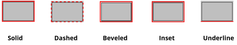
The appearances of Push Button with different line styles
Note: You may not see the difference if no color is chosen as the border color.
- Thickness – Specifies the width of the frame surrounding the push button: Thin, Medium, or Thick.
- Border Color – Opens a color picker in which you can select a color for the frame surrounding the button. To leave the button without a frame, select No color.
- Fill Color – Opens a color picker in which you can select a color for the button. To leave the button uncolored, select No color.
Note: A Fill Color choice other than No color will block any images on the PDF page that are behind the button.
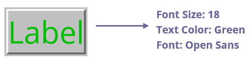
- Font Size – Sets the size of the label for the button. You can either choose Auto, various preset values, or type in a different value.
- Text Color – Opens a color picker in which you can select a color for the label.
- Font – Lists the fonts available on your computer.
Push Button
You can use the Position tab to make accurate adjustments to the position and the size of the button by entering specific values. Select the unit of the values. To move the button, enter values for the position properties (the Left/ Right/ Top/ Bottom options). To change the size of the button, enter values for the Height and Width options. To move the button without changing its size, select the Do not change height and width when changing the position option.
4. The Options tab for the button properties
The Options properties determine how labels and icons appear on the button. A button can have a label, an icon, or both. The Options tab in push button properties enables you to add any labels you like. The Options tab in push button properties contains the following options:
- Layout – Specifies the layout of label and icon of the button. There are seven choices:

A. Label only B. Icon only C. Icon top, label bottom D. Label top, icon bottom
E. Icon left, label right F. Label left, icon right G. Label over icon
Button Layouts
- Advanced – Does the details settings to the icon.
When to scale – choose when to scale the icon you insert. There are four options:
Always: scale the icon to fit the button you draw.
Never: never scale the icon. Show the icon with its original size all the time.
Icon is too Big: scale the icon down to fit the button if the former one is bigger than the latter one, or show the icon at its original size.
Icon is too Small: scale the icon up to fit the button if the former one is smaller than the latter one, or show the icon at its original size.
Scale – choose to scale the icon non-proportionally or proportionally. This option will be disabled when you select Never in the field of When to scale.
Proportionally: scale the icon in its proportion.
Non-proportionally: scale the icon to fit the button when the magnification is changed.
- Fit to bounds – check this option to scale the icon to fit fully within the bounds of the button without taking into consideration the line width of the border.
- Border – drag and move the scroll bar to change icon’s position in the button. The coordinates change when you move the scroll bar.
- Behavior – Specifies the display of the button when clicked. The button behavior options include:
None: Keeps the appearance of the button the same.
Push: Specifies appearances for the Up, Down, and Rollover states of the mouse. Select an option under State, and then specify a label or icon option:
Up: Determines what the button looks like when the mouse button is not clicked.
Down: Determines what the button looks like when the mouse is clicked on the button, but before it is released.
Rollover: Determines what the button looks like when the pointer is held over the button.
Outline: Highlights the button border.
Invert: Reverses the dark and light shades of the button.
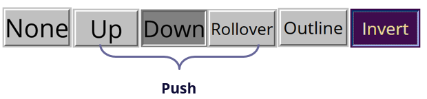
The Button Behaviors
- To define the label or icon that appears on the button, do the following:
- If a label option is selected from the Layout menu, type the text in the Label box.
- If an icon option is selected from the Layout menu, click Choose icon… > click Browse… > Select the file type from the Objects of Type menu, double-click the file name, and click OK. (To remove the selected icon, click Clear button.)
- Click Close to accept these display properties.
The Actions properties specify any actions that you want to associate with the push button, such as jumping to a specific page or going to a web site. The Actions tab in push button properties contains the following options:
- Select Trigger – Specifies the user action that initiates an action: Mouse Up, Mouse Down, Mouse Enter, Mouse Exit, On Receiving Focus, or On Losing Focus.
- Select Action – Specifies the event that occurs when the user triggers the action: Go to a page view, Open/execute a file, Open a web link, Show/hide a field, Execute a menu item, Submit a form, Reset a form, Import form data, and Run a JavaScript.
Go to a page view – designate to a specific page view. You can not only designate to a page in the current PDF, but also to the page in another PDF. Also, you may change the current zoom setting and then set the position.
To go to a page view, choose this option, click Add button and do one of the following:
a) Set the position in current document – scroll the current document, go to a new position where you want to set and click Set this position.
b) Set the position in another PDF document – click the Open button on the toolbar > select the PDF you want to set position > scroll this document and go to a position where you want to set > click Set this position.
Note: The new PDF document should be opened in the existing window but not a new window.
c) Change the view magnification -- scroll in the current document or another document > go to a new position where you want to set > change the magnification of the position > click Set this position.
d) Click Cancel to revoke your operation.
- Open/execute a file – designate to open another file. To do this, choose Open/execute a file > click Add button > select the destination file and click Select.
- Open a web link – designate to open a web link. To do this, choose Open a web link > click Add button > enter the URL of the destination web page.
- To show/hide a field, select the option > click Add… > choose to show or hide the selected button when the user triggers the action, and click OK.
- To execute a menu item, select the option > click Add… > select one of the items in Menu Item Selection dialog box, and click OK.
- To submit a form, select the option > click Add… > choose the export format, submission method, decide which fields should be submitted, and click OK.
- To reset a form, select the option > click Add… > select the fields that will be reset, and click OK.
- To import form data, select the option > click Add… > choose the FDF file that contains the form data you want to import, and click Open.
- To run a JavaScript, select the option > click Add… > enter JavaScript, and click OK. For more details, please refer to the JavaScript section.
- To read an article, select Read an article > click Add… > choose an article, and click OK.
- To set layer visibility, select the option > click Add… > click OK to set the target layer state of the selected action to the current state.
- Actions – Displays the list of triggers and actions that you have defined.
- Up and down buttons – Change the order in which the selected action appears listed under the trigger. (Available only when you have defined multiple actions for the same trigger.)
- Edit – Opens a dialog box with specific options for the selected action. You can also double-click the actions to open a dialog box.
- Delete – Removes the selected action.
Set push button properties as default
After setting button properties for a new push button, you can set your settings as the new default for all the push buttons you create in future. To set the current properties as default, right-click the push button > select Use Current Properties as New Defaults.
Set properties of multiple form fields
- Select multiple form fields > right-click one of them > Properties….
- There pops up the Button Properties dialog box, and then follow the steps specified above.