A list box is a GUI widget that allows the user to select one or more items from a list contained within a static, multiple line text box. Also, you can set a list box property that enables the user to Shift-click or Ctrl-click/Control-click to select multiple items on the list.
A text field is a common element of graphical user interface of computer programs, as well as the corresponding type of widget used when programming GUIs, which let the user type in text, such as name, address, phone number, etc.
For creating, moving, resizing, deleting, duplicating the list box and text field and setting tab order please refer to “Push button”.
Set list box properties
Please refer to “Set combo box properties”.
Set text field properties
Although most of the properties are common to those of combo boxes, the Options tab is exclusive.
1. For all the other properties of a text field, please refer to “Set combo box properties”.
2. The Options tab for the text field properties
- Alignment – Aligns the text left, right, or center within the field.
- Default Value – Specifies the text that appears until the user overwrites it by typing in the field. Enter the default value by typing in this option.
- Scroll long text – Compensates for text that extends beyond the boundaries of the text field.
- Allow Rich Text Formatting – Allows users to apply styling information to the text, such as bold or italic. This might be useful in certain text fields where such styling information is important to the meaning of the text, such as an essay.
- Limit of Characters – Allows entries of up to the number of characters you specify.
Note: If you entered a default value, that value is clipped to this limit.
- Password – Displays the user-entered text as a series of asterisks (*). This option is available only if Check Spelling is deselected.
- Field is used for file selection – Allows the user to enter a file path as the field’s value when a file is submitted along with the form. This option is available only when Scroll long text is the only selected option in the Options tab.
- Check spelling – Checks the spelling of user-entered text.
- Comb of Characters -- Spreads the user-entered text evenly across the width of the text field. If a border color is specified, Solid or Dashed Line is selected in the Appearance tab, each character entered in the field is separated by lines of that color. This option is available only when no other check box is selected.
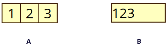
Text fields with and without the Comb property
A. Text field with a border color, using the Comb property
B. Text field without the Comb property
- Multi-line – Allows more than a single-line entry in the text field. Setting line spacing is available in a multi-line text field.
Set text field properties as default
To set the current properties as default, right-click the text field > select Use Current Properties as New Defaults.