A combo box is a commonly-used GUI widget. It is a combination of a drop-down list or list box and a single-line textbox, allowing the user either to type a value directly into the control or choose from the list of existing options.
For creating, moving, resizing, deleting, duplicating the combo box and setting tab order, please refer to “Push button”.
Set combo box properties
How a combo box behaves is determined by settings in the Combo Box Properties dialog box. You can set properties that apply formatting, determine the appearance and actions, perform mathematical operations, and so forth.
The combo box has a General tab, an Appearance tab, a Position tab, an Options tab, a Format tab, a Validate tab, a Calculate tab, and an Actions tab.
1. The General tab for the combo box properties
Please refer to “General tab for the radio button properties”.
2. The Appearance tab for the combo box properties
Please refer to “Appearance tab for the button properties”.
3. The Position tab for the combo box properties
Please refer to “Position tab for the button properties”.
4. The Actions tab for the combo box properties
Please refer to “Actions tab for the button properties”.
5. The Options tab for the combo box properties
You can create a list of items from which the user selects with the Options tab.
- Item – Accepts the text and space character that you type for options that you want to appear in the menu for the field.
- Add – Moves the current entry in Item to Item List.
- Export value – Where you type in a value to represent the item if the data will be exported. If left blank, the entry for Name in the General tab is used as the export value.
- Item list – Displays the choices that will be available in the list.
Note: The highlighted item in the Item List box appears as the default selected item in the combo box field. To change the default item, highlight another item from the list.
- Delete – Removes the selected item from the list.
- Up/Down – Change the order in which the items are listed in the combo box list. These buttons are not available if Sort Items is selected.
- Sort items – Arranges the listed items numerically and alphabetically. A numerical sort (if applicable) is performed before an alphabetical sort.
- Allow user to enter custom text – Enable users to enter a value other than the ones in the list.
- Commit selected value immediately – Saves the value as soon as the user selects it. If this option is not selected, the value is saved only when the user tabs out of the current field or clicks another form field.
6. The Format tab for the combo box properties
The Format tab in the combo box properties dialog box enables you to format the field values. Select one of the categories listed below:
- None – No additional options are available. The input in a combo box with this property does not require any specific formatting.
- Number Option – Automatically imposes the selected formatting options on numeric data entries.
- Decimal places – Sets the number of digits that appear to the right of the decimal point.
- Separator style – Sets the placement of commas and periods.
- Currency symbol – Sets the type of currency, such as Dollars, Euros, or Pounds.
- Symbol Location – Sets the position of the currency symbol relative to the numbers. (Available in Subscription Releases)
- Negative Number Style – Sets how negative numbers are displayed. You can choose Show parentheses, Use red text, neither, or both.
- Example of current format – Provides a preview of the formatting. You can adjust the settings instantly to fit your needs.
- Percentage – Automatically imposes the selected formatting options on numeric data expressed as a percentage.
- Decimal places – Sets the number of digits that appear to the right of the decimal point.
- Separator style – Sets the placement of commas and periods.
- Date – The list provides different types of date formats and you can choose one as desired. Once you select a date format, the format preview with the current system date will be displayed. Also, you can choose Custom option and type your format.
- Time – The list includes display variations where h stands for the hour on a 12-hour clock, H stands for the hour on a 24-hour clock, MM stands for minutes, ss stands for the seconds, and tt stands for AM or PM. Also, you can choose the Custom option and type your format.
- Special – There are five options for you:
- Zip Code – For a five-digit postal code.
- Zip Code + 4 – For a nine-digit postal code.
- Phone Number – For a ten-digit telephone number.
- Social Security Number – For a nine-digit US Social Security Number.
Arbitrary Mask -- Changes the format category to Custom and makes another text box available, in which you can type a custom format. Use this option to specify which types of characters the user can enter in any given position, and how the data displays in the field.
a. A -- Accepts only letters (A–Z, a–z).
b. X -- Accepts spaces and most printable characters, including all characters available on a standard keyboard and ANSI characters in the ranges of 32–126 and 128–255.
c. O -- The letter “O” accepts alphanumeric characters (A–Z, a–z, and 0–9).
d. 9 -- Accepts only numeric characters (0–9).
For example, a mask setting of AAA--p#999 accepts the input BDF--p#367. A mask setting of OOOOO@XXX accepts the input vad12@3Up.
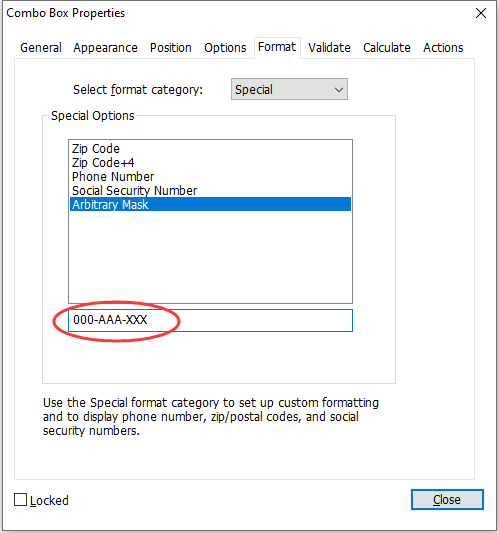
Example of an Arbitrary Mask entry
- Custom -- Makes additional options available to form designers who want to write their own JavaScripts for formatting and keystrokes. For example, a custom script could define a new currency format or limit the user entry to specific keystroke characters.
- Custom Format Script – Displays any custom scripts you have added for formats. The Edit button opens a JavaScript Edition dialog box in which you can write and add new scripts.
- Custom Keystroke Script –Displays any custom scripts you have added to validate keystrokes. The Edit button opens a JavaScript Edition dialog box in which you can write and add new scripts.
7. The Validate tab for the combo box properties
The Validate properties restrict entries to specified ranges, values, or characters, ensuring that users enter the appropriate data for a combo box.
- Field value is not validated – Turns off validation.
- Field value is in range – Sets a numeric range for a combo box using values you enter in either as a number or a percentage. It is available only when Number or Percentage is selected in Format tab.
- Run custom validation script – Validates by a JavaScript that you create or provide. The Edit button opens a JavaScript Edition dialog box in which you can write and add new scripts.
8. The Calculate tab for the combo box properties
With this option, you can perform mathematical operations on existing form field entries and display the result.
- Value is not calculated – Select this option if you want the users to type.
- Value is the – Select this to make further options available:
- The List includes the mathematical functions to apply to the selected fields. Choose Sum to add the values entered in the selected fields, Product to multiply them, Average, Minimum, or Maximum.
- Pick – Opens a Field Selection dialog box with a list of the available fields in the form that you select to add or deselect to remove from the calculation.
- Simplified field notation -- Uses JavaScript with field names and simple arithmetic signs. The Edit button opens a JavaScript Edition dialog box in which you can write, edit, and add scripts.
- Custom calculation script -- Displays any custom scripts you have added for calculations. The Edit button opens a JavaScript Edition dialog box in which you can write and add new scripts.
Set combo box properties as default
After setting combo box properties for a new combo box, you can set your settings as the new default for all the combo boxes you create in future.
To set the current properties as default, right-click the combo box > select Use Current Properties as New Defaults.