A check box is a type of form field that presents yes-or-no choices for individual items. For creating, moving, resizing, deleting, creating multiple copies, duplicating a check box and setting tab order, please refer to “Push button”.
Set Check Box Properties
There are also five tabs, a General tab, an Appearance tab, a Position tab, an Options tab, and an Actions tab, for you to set check boxes’ properties.
The General tab
Most items in this tab are the same as the ones in the properties of Push Button. Please refer to Set Push Button Properties for details. For the Required option:
- Required – Forces the user to select the check box. If the user attempts to submit the form while a required check box is not selected, an error message appears.
The Appearance tab
Please refer to Set Push Button Properties.
The Position tab
Please refer to Set Push Button Properties.
The Actions tab
Please refer to Set Push Button Properties.
The Options tab
Check Box Style - Specifies the style of the check box. There are six choices:
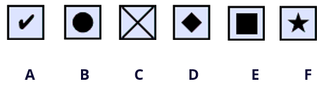
Check Box Style
A. Check B. Circle C. Cross D. Diamond E. Square F. Star
Export Value - Identifies the check box and differentiates it from other check boxes that share the same Name value.
Checked by default – Sets the selection state of the check box when the user first opens the form.
Notes:
- If you create multiple copies of the check box, please make sure both the form field names and the export value are all different in related check boxes.
- If the check boxes in a group have the same form field name but with different export values, the check boxes will present a group of choices from which the user can select only one item.